Showing posts with label color. Show all posts

Thursday, December 9, 2010

My 2011 Color Prediction - Close But No Cigar

You may remember back in July when I predicted red would be the color of 2011. Well, I was close but not close enough. Pantone predicts Honeysuckle as the Color of the Year for 2011.

Per Pantone, "Honeysuckle emboldens us to face everyday troubles with verve and vigor. A dynamic reddish pink, Honeysuckle is encouraging and uplifting. It elevates our psyche beyond escape, instilling the confidence, courage and spirit to meet the exhaustive challenges that have become part of everyday life.

“In times of stress, we need something to lift our spirits. Honeysuckle is a captivating, stimulating color that gets the adrenaline going – perfect to ward off the blues,” explains Leatrice Eiseman, executive director of the Pantone Color Institute®. “Honeysuckle derives its positive qualities from a powerful bond to its mother color red, the most physical, viscerally alive hue in the spectrum.”

As the saying goes, "Close but no cigar!"

Thursday, December 2, 2010

Christmas Mantel: A Favorite

This beautiful image graced the cover of Canadian House & Home in November 2006. The blue and green Christmas decor is inspired by the patterned fabric on the stuffed chairs. This is one of my all-time favorite images and I always thought it was a living room. It wasn't until this post that I realized this is the entrance hall of the home! (Design by homeowners Dale and James Egan, photography by Mark Bursty)

Wednesday, November 17, 2010

Red, Purple & Orange All at Once

I'm sure there are more accurate names for the reds, purples and oranges appearing here but the combination of these three dominate colors caught my eye. By the way, what would you call the color of the velvet chair?
Images from the home of Laura Ponte via Nuevo Estilo here.

Thursday, September 9, 2010

Perfection in White

John Jacob Zwiegelaar of John Jacob Interiors is one of my all time favorite designers. Only in his early 30's, he opened his Cape Town firm in 2005 and already has an impressive portfolio. This home appeared in the May 2006 issue of House & Garden South Africa. I hope you enjoy looking at it as much as I do. It's almost Friday!


All images via the site John Jacob Interiors here.

Tuesday, August 3, 2010

Chicago's Mecox Gardens - always a favorite

I mentioned the great tablescapes of Ken Chrzastek of Chicago's Mecox Gardens in an earlier post on red. Here's some more red & lots more eye candy from whenI visited this beautifully styled store back in June.

Also - you may have noticed the posts have been a bit sparse. I've been in Seattle and am now in Cape Cod and will have lots of fun things to post about soon. Hope you're enjoying your summer!


Wednesday, July 28, 2010

Predicting Red for 2011 Color of the Year


O.K. - I'll either look back at this post fondly or with egg on my face but I have a feeling that red is going to be the Color of the Year in 2011. What do I base this on? It's certainly not any market research but I have been noticing & admiring the color red lately. I emphasize the "admiring" part as I've never been one to care for red and if I'm starting to like it that must mean something (or, nothing at all!) The red bead
chandelier is from Julia Edelmann's design studio in Chicago. You may remember the previous version in turquoise. (I've forgotten who designed this chandelier)

Here's the new Rose Line lamp from CB2 - they chose a red cord. Below is a bar arrangement styled by Ken Chrzastek of Chicago's Mecox Gardens. I think Ken creates the best store vignettes ever and if he's drawn to an all red bar palette...

So, what do you think? Could it be RED or am I totally off-base?

(p.s. - I'm on travel and posted this from my iPad w/wireless keyboard. Love it!)

Thursday, July 8, 2010

Has Anyone Read This?

Has anyone read this book from Margaret Bach? This is one of the best book covers I've seen in a long time. Of course, love the shock of fuschia color in those flowers. Are they bougainvillea?
(photography by Melba Lewick)

Tuesday, July 6, 2010

Room Envy: Fuchsia

Love the repetition of fuchsia throughout this living room. Just noticed how the fuchsia stripes on the chairs are repeated in a fuchsia tone-on-tone stripe on the pillows. Beautiful and vibrant - caffeine not necessary in this room.

Home of Raquel Oliva, From Nuevo Estilo here.

Tuesday, May 11, 2010

L's Stylish Powder Room

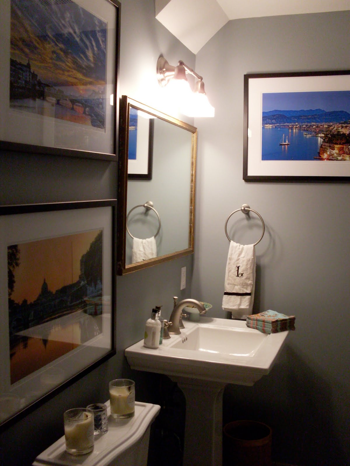
Here's a bit more from L's house - a stylish powder room. I think it's a case-in-point of how a simple room can be elevated with color and great accents. There are no windows in the room so all the large framed photos substitute - providing gorgeous views of beautiful places in Italy.
The green wall color extends to the accents chosen for the sink - a footed bowl, napkins and the Molton Brown soap.
A little wooden side table is practical and pretty.
Even though this picture is blurry, couldn't resist posting it. Love the attention to detail. To see more of L's special home, go here.

Wednesday, March 31, 2010

Extraordinary Home: Part 2

There is so much to share from this home and the gardens that I plan to do it in installments. I think of this house like a wonderful confection - to be savored a bit at a time. At this welcoming back entry you are greeted by a pink heart enscribed with the word Love. The door is wonderfully framed by the shutters and the arch.
Umbrellas and hats to your right...
and croquet mallets and jump ropes to your left!
A kitchen counterscape of lovely things.
The gorgeous porcelain box holds tea.
A microwave and wall oven marries with the art on this wall.
I really fell for these beautiful seascapes by artist Radford Wine.
Collected treasures on a gorgeous wood desk.
The faux bois piece was the owned by the late Bill Blass.
More whimsy; a little modern blue chair sized just right for a grandchild.

The view from the upstairs to the main entry. Light and fresh even on what was a very overcast day. Notice the two croquet mallets here too.
A bookscape of pink and orange, arranged almost as a present. More to follow in the coming weeks from this original home.

Wednesday, December 23, 2009

Ragland Hill Social: A New Blog!

As 2009 comes to a close, I'm very excited to have come across a new blog, Ragland Hill Social (although a number of smart bloggers found this one before me!). Written by designer Gwen Driscoll, her collection of virtual tear sheets is incredible and her own designs are gorgeous as well. The first picture is of her library - love the dark ceiling with the gold painted design.
I think the arched panelled mirror to the side of the fireplace in this room is brilliant. Love all the pattern in the pillows and ottoman.
Here is a dining room and living room from one of her client's home. To see more from this beautiful home, go here.

Gwen uses the term appointments in reference to accessories - I rather like that. Here is a french buffet in her sunroom that she recently edited.
Finally, I'd like to point out that Gwen posted an entire week about the color green. I have never seen a more definitive exploration of that color - it is something not to be missed! 2010 is looking to be a great year for design blogs.

Monday, October 5, 2009

The Room that Launches a Color Craze

Every so often a singular room launches a color craze. You might think of it as the "tipping point room" - that one additional photo that makes you think, "I've got to have this color in my house!" In my opinion, Anna Beth Chao's bedroom, recently featured in All the Best's bedroom contest, is that tipping point room. Painted in Farrow & Ball's Down Pipe (26), it is modern, stately, chic and cozy all at once. I could be wrong, but I think the success of Anna Beth's room may inspire alot of people to try this gorgeous deep blue gray in their own homes. **Update - Anna Beth has a blog - www.hashai.com **Design by Anna Beth Chao, Reader's Choice Award and Honorable Mention - All the Best Bedroom Contest

Farrow & Ball's Down Pipe is used on the ceiling of this formal dining room with it's very hip gold chandelier. Designer Jessica Lagrange Interiors, image from Chicago Home, Sep - Oct 2009

Anna Beth said her choice of Down Pipe was inspired by the designs of Abigail Ahern. Here are two rooms from Ahern's own apartment.

A room featured in Ahern's book, A Girls Guide to Decorating, graces the November 2009 cover of Living etc.

In Canadian House & Home's Makeovers special edition they feature Down Pipe in their Most Wanted section, pg.24 (thank you Terri of Windlost). They also offer two alternative paints that are close in color: Brainchild CL3216A by General Paints and Knight's Armor 518-6 by Pittsburgh Paints.
I'm not sure if the wall in this interior by John Jacob Zwiegelaor is Down Pipe, but it's fairly close.
Back in the beginning of September, I painted the fake 50's stone hearth and surround of my fireplace with Down Pipe after I changed the wall color from a green yellow to a light blue gray.
At the time I was feeling quite pleased with myself because I only spent $14 to finish the project, $7 for each sample pot. But now it's all gone and I'm sitting around here conjuring up what other surfaces in my house I can paint Down Pipe!
I guess I should have forked up the $89 and bought a gallon...